Systems · Operations
Operating instruments
A dashboard is a claim about what is true. Most of them are built so that the claim cannot be checked — no source, no as-of, no threshold, no admission of what is missing. These are the devices I use to make the claim checkable, and none of them is difficult.
Every figure on this page is a reconstruction, built from invented data. The layouts, the treatment and the devices are the ones I actually use. The numbers, names and dates are not real and are not drawn from any organisation's records.
Start with provenance, not the number
Every artifact opens the same way: an as-of date, where the period stands, and what triggers the next refresh. Then a classification chip, which says who may read it and — where it matters — what has to come out before it is shared.
This costs one line and settles most arguments before they start. A figure without a date is not a figure; it is a rumour with a typeface. The refresh trigger matters as much as the date, because "monthly, and whenever material money lands" tells a reader whether silence means stable or means nobody has looked.
Do not let proposed money look like base
Budget reporting fails in a specific way. Something plausible is added to the forecast, the forecast improves, and three months later nobody can reconstruct which parts were money and which were hope.
So every line carries a confidence tag: committed, proposed, at risk, fix, policy. Committed is in the base. Proposed is not, however likely it looks. And a bridge from the adopted budget to the projected outturn shows every change since adoption as its own step, so the question "why are we here" has an answer with dates on it.
Note what the hatching does. The pending claim is the entire difference between a shortfall and breaking even, and it sits outside the total, drawn in a fill that cannot be mistaken for a solid number. If it lands, the outturn moves. If it does not, nobody is surprised, because it was never counted.
Count progress honestly
Delivery reporting has its own dishonesty. Percentage complete is usually subtasks-done over subtasks-total, which rewards parking the hard ones.
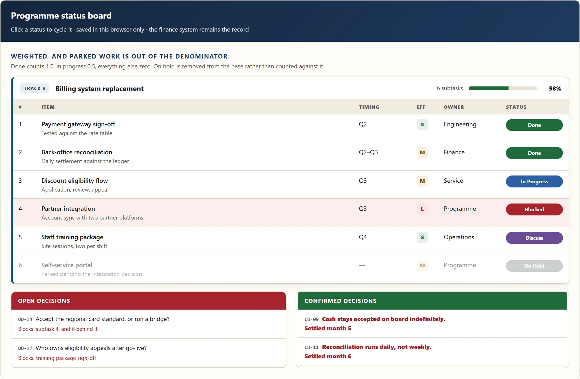
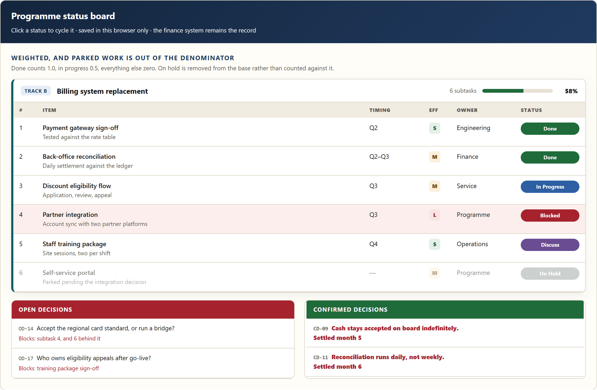
The version I use weights it — done counts one, in progress counts a half, everything else counts nothing — and then removes parked work from the denominator entirely. Putting an item on hold no longer improves the headline. It takes the item out of the measurement and leaves it visible, faded, where somebody has to look at it.
Blocked rows are tinted rather than flagged, so exceptions are found by scanning rather than by reading. And decisions are first-class objects with identifiers, split into two panels: what is open, with what each one blocks, and what is settled, with the date it was settled. Half of programme delay is a decision nobody realised was outstanding.
The board at the top of this page is that rule in use: six items, one blocked and tinted, one parked and faded, and a headline that did not get better when the parked one stopped counting against it.
When the number is really a policy choice
A capital asset plan reports equipment condition against a useful life benchmark — the age at which an asset class is considered past its serviceable life.
Here is the part that is easy to miss. The benchmark is a choice. Adopt the manufacturer's default and one figure comes out; adopt a shorter, locally justified benchmark and a different one does — from the same asset register, on the same day, with no machine having changed. The gap between those two answers is not small. It can be the difference between reporting a quarter of the equipment past benchmark and reporting more than half.
Neither answer is wrong. Publishing either without naming the basis is. The obligation is to state which benchmark you adopted, keep it consistent everywhere you report it, and be able to say why — because every replacement target in the plan hangs off it. An engineering-sounding number resting on a policy decision is the most quietly misleading object in operating reporting, and asset condition is full of them.
Say what the artifact is not for
The most useful sentences on any of these surfaces are the ones that limit them. The finance system is the record; if this board and the ledger disagree, the ledger is right. Cost per order is not comparable across product lines. These bands are proposed defaults and should be tuned against actuals. Status changes are saved in this browser only.
None of that is modesty. Each line closes a specific way the artifact would otherwise be misread, and closing it in writing is cheaper than closing it in a meeting.
And when it goes out of date, say so on its face
This is the device I would keep if I could keep only one.
A board that has been superseded does not get deleted, because deleting it does not stop anyone quoting the copy they already have. It gets a red header across the top reading do not read numbers off this board, and then it does the work: it lists the figures now known to be wrong with their corrected values, the events it predates, and where the current numbers live.
A deleted artifact teaches nobody anything and keeps circulating anyway. One that carries its own correction turns a stale number into a record of what changed and when — and it makes the next person's question easy to answer, which is most of the job.
The through-line
None of these devices is clever, and that is deliberate. There is no modelling here, no machine learning, no dependency that expires. They are all the same move applied in different places: make the artifact state what it knows, what it does not, and how you could tell the difference.
That is the same rule the maintenance system runs on with its verify flags, and the same one that keeps a decision engine saying no. It happens to matter more when the reader is a board, and the subject is someone else's money.
The headline scorecard these instruments sit under has its own page. The same discipline pointed outward, at a customer with a problem, is in the customer-first website concept.