Systems · Service design
Customer-first service, a website concept
Almost every service organisation's website is laid out like its org chart. Customers do not arrive with an org chart. They arrive with one of six questions, and the whole argument of this build is that you can answer all six above the fold.
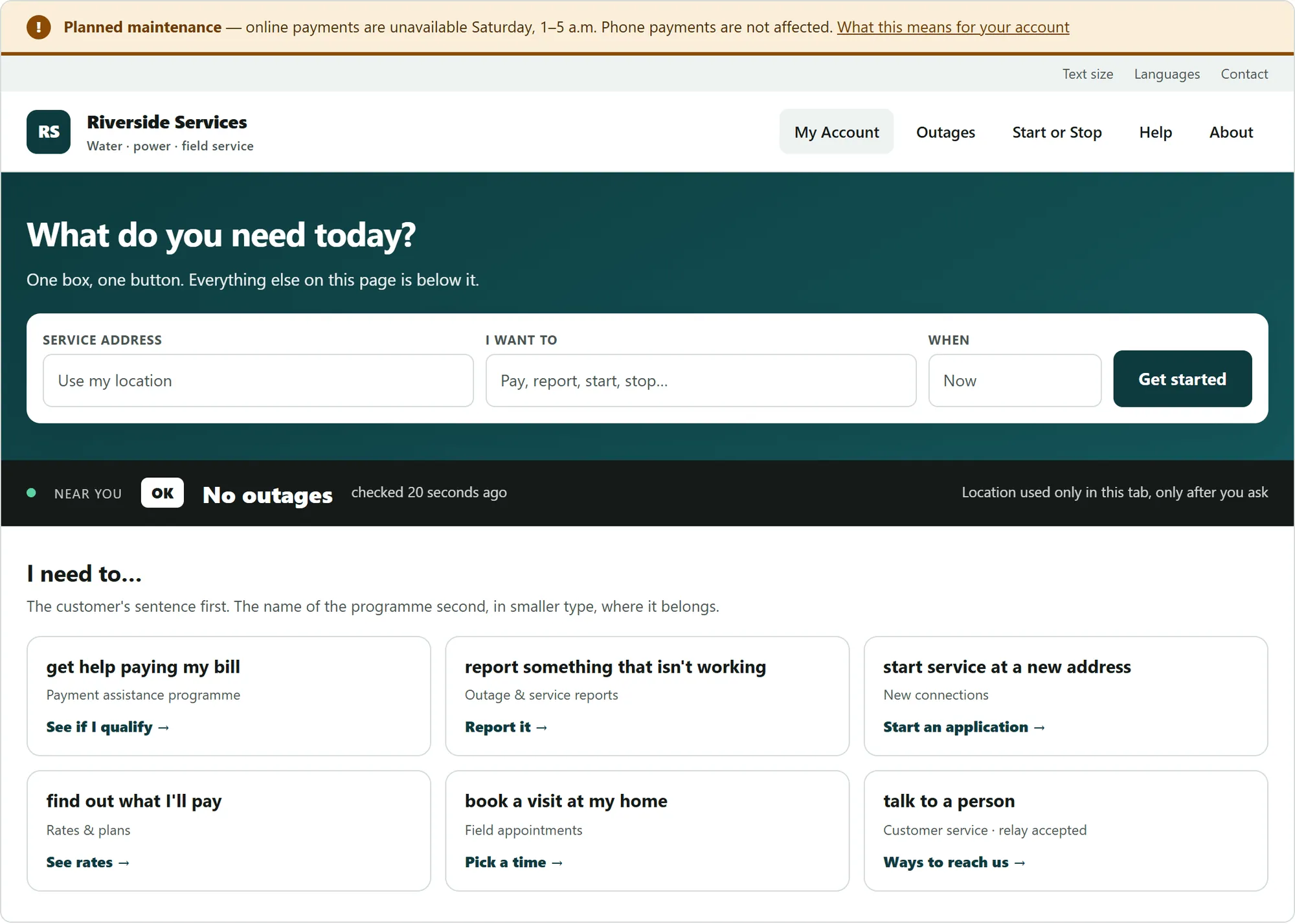
Built on my own time as a working concept, not a deliverable — real pages, a shared stylesheet, and a generator, rather than a slide deck. The figures below are reconstructions: the structure and treatment are the ones I built; the organisation and every office, time and programme in them are invented.
The six
Is something wrong today? How do I pay, or get help paying? How do I start or stop? What will it cost me? Can someone come out? Who do I call?
That is the entire requirements document. Everything an organisation wants to say about itself — its leadership, its strategic plan, its annual report — is real work and belongs on the site, but it is not what the person with a problem at seven in the morning needs, and it should not be competing for the same space.
The alert band goes above the logo
The most consequential decision on the page is also the least designed-looking. If something is wrong with the service today, the customer needs to know before they know whose website they are on.
So the alert region sits above the masthead, is present in the markup even when empty, and is announced rather than merely displayed. Below it, one hero, one heading, one call to action. Most people came to do one thing; giving that thing a carousel to compete with is a choice to serve the fewest people.
Name the task, not the programme
The task router is the part I would argue hardest for. Every card leads with a sentence a customer would actually say — get help paying my bill, book a visit at my home — and puts the programme name underneath, in smaller type.
This is not a copywriting flourish. Someone who is behind on a bill does not necessarily know the phrase "payment assistance programme." Leading with the programme name is a comprehension test, and the people most likely to fail it are exactly the people the programme exists for.
A few pages, each solving one hard thing
Rather than twenty-five near-identical pages, the concept is a short set, and each one was chosen because it is the hardest instance of a pattern the whole site needs:
- A schedule table that stays readable and correctly associated at any width — the most common accessibility failure on service sites, and the one below.
- A multi-step eligibility form with a real error summary — the second most common.
- A filterable list that announces its result count, because filtering that changes the page silently is a failure, not a nicety.
- Consent-first geolocation: nothing is requested until the customer asks, and the page says so where they can see it.
- Long-form policy content with a table of contents, because an obligation that nobody can navigate is not discharged.
A schedule is a table, and a table that reflows into a grid on a phone loses the association between a time and its place — which is invisible if you can see it and fatal if you are hearing it read aloud. So it does not reflow. Each office is its own block with its own times, at every width, and the accessibility facts about that office sit with it rather than in a legend elsewhere.
The chrome is generated, not copied
Every page's alert band, utility bar, navigation, skip links and footer come from one definition. The verification that mattered was checking that the navigation and footer markup were byte-identical across every page — because hand-maintained chrome drifts, and drifted chrome is how a skip link ends up missing on the one page that needed it.
The same rule applied to fixes. Heading-order breaks were corrected in the generator rather than patched in the output, so they cannot come back on the next rebuild. Design tokens carry their measured contrast ratios in the comments beside them, the text-size control actually works rather than gesturing at accessibility, and the focus style is a dual ring that inverts on dark surfaces so it never disappears against a hero.
What it deliberately does not do
Written down as a list, because omissions drift back in when nobody has named them: no carousel, no hover-only menus, no PDF standing in for content, no icon-only buttons, no dialog on page load, no infinite scroll, no autoplay — and no status carried by colour alone. Every alert has an icon and a word as well as a hue.
What it doesn't claim
The build ends with a paragraph I would want on far more work than carries it: this is not a conformance claim. Automated checks catch something like a third of accessibility issues. What remains is a keyboard pass, a screen-reader pass, a two-hundred-percent zoom and narrow-width reflow check, and an independent audit by someone who was not involved.
Alongside it sits a register of content placeholders left deliberately unresolved, each with the reason it was not guessed at — a phone number, a threshold, a service window. Filling those in with something plausible would have made the concept look finished and made it wrong, and a wrong service window is somebody waiting at a locked door.
That is the same instinct as the verify flag on the maintenance system and the stale banner on a retired dashboard. State the limit on the face of the thing. It costs a paragraph and it is the difference between work somebody can rely on and work that merely looks finished.
The inward-facing half of the same discipline — the instrumentation a board reads — is here, and the scorecard itself is here.